Friday, 21 February 2014

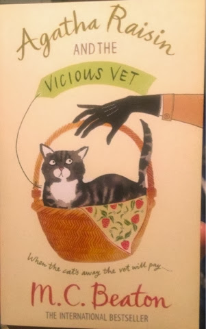
Agatha Raisin cover


Agatha Raisin series, written by M. C. Beaton. 

This series has been re-released with this light, illustration-based style of cover. I like it, of course. 

The books are good fun in that flippant whodunit style. Although I have to say that M. C. Beaton has an absolutely scathing way of describing some characters. Painfully merciless. 

I was a bit of a fan of the Hamish MacBeth TV show, based on her other well-known book series, which I've not had the chance to read. But I read recently that Beaton is NOT a fan of the show. In the books, Hamish MacBeth is a apparently a burly chap. In the TV show, he's a skinny pot-smoker (as played by Robert Carlyle). 

Fair enough, I'd be annoyed too, if someone messed with my character from my imagination that much. 

I wonder how they'd go bringing Agatha Raisin to life??

Notebook Cover


I love stationery! 

Show me someone who doesn't like/ can't appreciate stationery, and I show you my enemy. 

I especially love notebooks - new, blank, pristine - and ready to become a treasure chest filled with a universe of ideas. 

There is a ridiculous side-effect though: the prettier/groovier the cover, the greater my expectation that the content I will fill it with is special and worthwhile - content that is worthy of the cover. 

This notebook is now a couple of years old. But that's nothing for me. I once held on to 2 special notebooks I received as a child for 17 years total before I found a deserving use for them!

This one will probably be hanging around a good while yet. 


Chick Lit cover #3


Julie Ortolon, Almost Perfect. Signet Eclipse. 

Oooh. It's quite similar to Chick Lit Cover #2, isn't it?? I'd not noticed that before. 

I wonder if the whole lighthearted-illustration-of-delicate-female-legs-minus-torsos-or-faces on covers will become a recurring stylistic thing.

Something to watch out for...

Waikiki Cover


The Waikikis: Greatest Hits from Hawai'i

The best bargain bin find ever! 

Delightfully seventies vibe to this cover - especially those little flowers. 

And great sounds too!

Monday, 17 February 2014

The Stitch in Time Series cover

In the previous post, I talked about the book, Many Waters by Madeleine L'Engle.

When I re-encountered the book in a secondhand bookshop in the Blue Mountains, I was surprised to find out there were a couple more, and that they were part of a series. 

I grabbed the 3 other books in the series with covers in similarly-styled illustrations, all of which looked very new. The bookshop owner told me they were part of a box set; the owner said he hadn't included the box because the series was missing book 1. He offered me the box and I accepted with alacrity. 

The box itself is the feature for this post. It is its own thing of beauty with beautiful illustrations. 

This is what you see on either side of the box. Did any illustration depict story-telling more beautifully??

You've got ghosts, fantasy, space, the exciting and the unknown... Perfection!!
 

My 4 books from the Stitch in Time Series (minus book 1), by Madeleine L'Engle. 

The stories await their telling...

Many Waters Cover


Madeleine L'Engle, Many Waters. Square Fish. 

It's amazing when a cover can throw in all the crucial elements of the story. And I love the illustration style. 

I first encountered this book when I was a teenager. It was not my normal reading choice at all. I was in my Agatha Christie phase, I think. But I was sick at home and my dad was going to the library and I asked him (fretfully and in the self-pitying way one has when one is sick) to find some interesting books for me. 

Many Waters was one of them. I remember looking at it dubiously. The library book cover was a beige-yellow and had a couple of ribbons of blue. Not my kind of book at all. 

But I was sick, bored and started reading it reluctantly - and got totally suckered in. Twins who travel back in time to just before the time of Noah's Ark and the flood - a time when angels, seraphim and nephilim, walked among people. A beautiful, layered and complex story. 

I never forgot the story or the title and was very excited when I found it looking glossy and new in a second-hand bookshop. 

But there's a bit more to the story. Cut through to the next post. 

Sunday, 16 February 2014

Smashing Clashing Album Cover


The Clash: Combat Rock. 

Awesome album! And iconic cover to match. 

So the story goes, this photo was just taken as a snapshot while the members of The Clash were holidaying in Asia (Thailand, I think). And the holiday snap became the album cover. 

I'm not sure - even if you tried to take a similar photo today in a similar setting - that the mix of: flippant pose, lost-in-his-own-thoughts, orthodox pose, distracted reaction, would come out the same. There's a lot more glossy/idealised self-representation in Selfie-World now. It would make for an interesting experiment...